10統計的推定と仮説検定 / Statistical Inference and Hypothesis Testing (2)
【目次/TOC】
1. 量的変数の関係/Relationships Between Quantitative Variables
10.3.1 Excel による散布グラフとバブルチャート/Visualizing Relationships: Scatter and Bubble Charts in Excel

本ウェブページは『超入門 はじめてのAI・データサイエンス』第10章の10.3に対応したコードを埋め込んでいます。まずは,量的データの2変数の関係を把握するのは散布図についてです。 動画ではExcelによる散布図の他に,途中でバブルチャートの作り方も見せていますが,バブルチャートのできないPC環境があるようです。過去にはPCが固まってしまう人もいたようなので,バブルチャートを試すのであれば,その前に必ずファイルを保存またはバックアップをとっておきましょう。
This webpage corresponds to Section10.3 of Session 10. The primary method for understanding the relationship between two quantitative variables is the scatter plot. The video shows scatter plot in Excel and bubble chart, too. There seem to be environments where bubble charts are not supported. In the past, some people experienced freezing issues with their computers, so please save or back up files before attempting the bubble chart.
ここでのタスクは, 年齢とカード利用回数は関係があるかを探索することです。 散布図では,その横軸(X)も縦軸(Y)も量的データになります。 Xが独立変数または説明変数,Yが従属変数または目的変数でしたが,この場合,年齢によってカードの利用回数は変わるかもしれませんが,カードの利用回数によって年齢は変わらないので,X軸が年齢,Y軸がカード利用回数となるのが適切です。
The task here is to explore whether there is a relationship between age and card usage frequency. In a scatter plot, both the X-axis and Y-axis represent quantitative data. The X-axis is the independent or explanatory variable, while the Y-axis is the dependent or response variable. In this case, age may influence the card usage frequency, but the card usage frequency does not affect age. Therefore, it is appropriate to use age as the X-axis and card usage frequency as the Y-axis.
それでは動画の手順です。シートから,年齢とカードの列を選びます。集計行まで選ばないように注意します。Excelは自動的に左側にある列をX軸としますが,どちらの列をX軸Y軸にするかは,いつでも切り替えられます。挿入,グラフから散布図を選びます。
可視化による探索的分析として,データの特徴を視覚的に確認します。グラフから,ざっと3つの点を確認します。
Here is what is done in the video. From the sheet, select Age and Card columns. Be careful not to select the total row. Excel will automatically assign the leftmost column as the X-axis, but you can always switch the columns for the X-axis and Y-axis. Choose "Insert" and then select "Scatter" from the "Charts" section.
As an exploratory analysis with visualization, visually examine the characteristics of the data. From the chart, observe three main points.

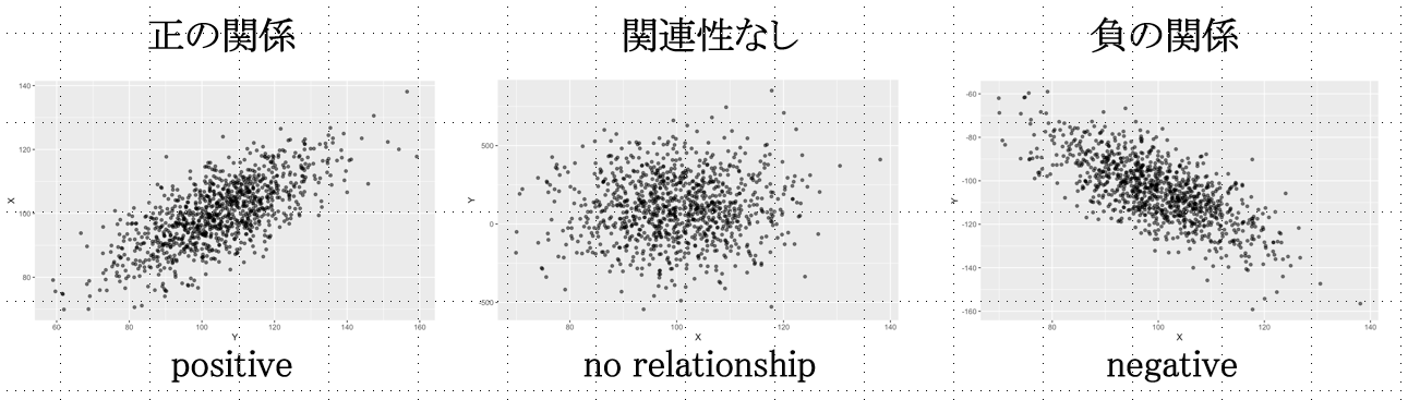
第1に,関係性の傾向です。動画の場合,全体に右上がりの分布になっていて,年齢とカード利用回数が正の関係,つまり,年齢が高いほどカード利用回数が多い傾向が見て取れます。関係性は直線的であるとは限りませんが,直線的な関係の場合には,下図のように,右下がりの分布の場合は,負の関係,XYに関係のない場合は,Yの平均値(X軸に平行な水平線)を中心に値が分散しているプロットになります。
First, tendencies of relationship. In the video, the overall distribution is upward-sloping, indicating a positive relationship between age and the number of card transactions, i.e., the older the age, the more frequent the card usage. Although the relationship is not necessarily linear, in the case of a linear relationship, if the distribution is downward-sloping, there would be a negative relationship, or if there is no relationship between X and Y, the plot would have values distributed around the mean value of Y (the horizontal line parallel to the X axis) as shown in the figure below.
第2に,分布の範囲や集中度などを確認します。動画の場合,年齢は18歳以上しかデータにないことがわかります。
Second, check the range and concentration of the distribution. In the video, the age data includes only ages 18 and older.
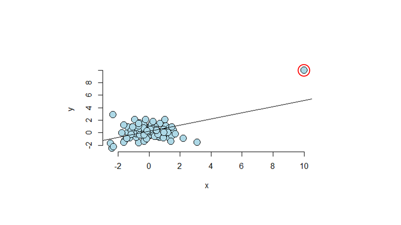
第3に,外れ値を確認します。 これがなぜ問題になる可能性があるかというと,たとえば下図のように,ほとんどのプロットがランダムに分布しているのに,外れ値(下図の赤い丸)によってまるで右上がりの正の関係があるかのような統計量が出てしまうことがあるからです。 悪い場合には,この外れ値は異常値ですらなく,データクリーニングの不足による誤ったデータが入り込んでいるケースである場合もあります。なので,分析をする前に可視化をしてデータを確かめておくことが大切なのです。 なお特定の値を外れ値として分析から外すかどうかは分析者の判断で,外す場合には報告書に記しておく必要があります。
Third, check outliers. The reason why outliers can be a problem is that, for example, as shown in the figure below, even if most of the plots are randomly distributed, one outlier (red circles in the figure below) can produce statistics that make it look as if there is an upward-sloping, positive relationship. In the worst case, the outlier may not even be an outlier, but rather a case of incorrect data due to insufficient data cleaning. Therefore, it is important to visualize and check the data before analyzing. It is the analyst's judgment whether or not to exclude certain values as outliers, and it should be noted in the report if excluded.
X軸の最小値を15歳にします。つぎに動画では,外れ値が誰であるかを確かめています。 ラベルオプションでY値のチェックを外して,セルの値にチェックを入れ,範囲に氏名のセル範囲を指定して、外れた値の個人を特定しました。 確認後は,データラベルを消しておきます。そして軸ラベルを入れました。
The minimum value of the X axis is set to 15 years old. In the video, outliers are identified by unchecking the "Y value" in the Label Options, checking "Value from Cells" instead, and specifying the cell range of "Name" in "Data Label Range. After identifying outlier, the data labels are removed. Then Axis Titles are added.
動画では3変数の関係を把握するバブルチャートに変えています。 バブルチャートは3つ目の変数を入れることが出来る便利な図です。 ここでは3つ目の変数はAmount(動画では>「金額」)にしています。グラフの種類からバブルチャートを選び,データのバブルサイズがすべて1になっているのを消去して,Amountのセル範囲を入れました。 バブルが大きすぎてわかりづらいので,バブルを小さくするのに,バブルのどこでもよいのでクリックをして書式設定を出し,バブルの大きさを小さくしました。その後,色を変えて,タイトルを付けました。
In the video, the scatter plot was turned into a bubble chart that captures the relationship of three variables. The bubble chart is a convenient chart that allows for the inclusion of a third variable. In the video, the third variable is Amount. I chose a bubble chart from the chart type, erased all the bubble sizes of the data that were all set to 1, and put in a cell range for Amount. If bubbles were too large to understand, click anywhere on the bubbles to bring up the format selection to reduce the size of the bubbles. I then changed the color and added a title.
Mac/日本語
Win/English
10.3.2 相関/Correlation
それでは,XYに正・負の関係があるかどうかをどのように数値にすれば良いでしょうか?xの偏差 × yの偏差の積を考えてみましょう。
How can we quantify whether there is a positive or negative relationship between X and Y? Let us consider the product of the deviation of x and the deviation of y.
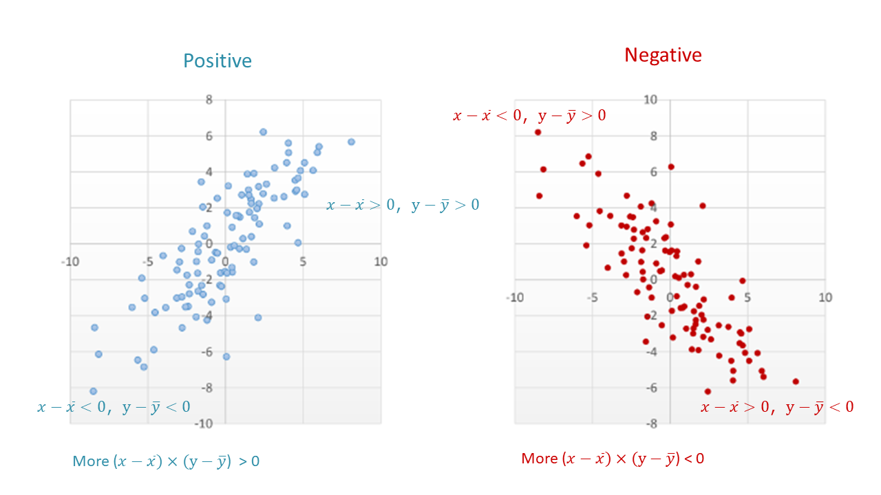
上図に見るように,平均値を中心として4つの区画に分けてみると,右上がりの正の関係のときには上式が正になる,つまり左下と右上の区画に入るプロットが多く,右下がりの負の関係の時には上式が負になる,つまり左上と右下の区画に入るプロットが多くなります。その平均,つまり総計してnで割ったsxy下式を共分散(covariance)と言い,これが正の値のときには正の関係,負の値のときには負の関係を示します。ただ,値の大きさは単位に依存するので,関係性の大きさを判断するのには不向きです。
As seen in the above image, if we divide the data into four areas with the mean values at the center, when the relationship is positive, there are more plots in the lower left and upper right areas where the product above will be positive, and when the relationship is negative, there are more plots in the upper left and lower right areas where the product above will be negative. Covariance sxy is the average of the products above, which shows a positive relationship when the value is positive and a negative relationship when the value is negative. However, since the magnitude of the value depends on the unit, it is not suitable for determining the magnitude of the relationship.
\[s_{xy}=\frac{\sum{(x_i-\overline{x})×(y_i-\overline{y})}}{n}=\frac{偏差の積の総和}{個数}\]
\[s_{xy}=\frac{\sum{(x_i-\overline{x})×(y_i-\overline{y})}}{n}=\frac{Sum \, of \, products \, of \, deviations}{total \, number}\]
標準偏差で割れば単位の大きさが調整されて比較可能になります。共分散をxの標準偏差とyの標準偏差で割ってみましょう。そうすれば関連性の大きさを比べることが出来ます。
Dividing by the standard deviation adjusts the scales to be comparable, so divide the covariance by the standard deviation of x and the standard deviation of y. That allows us compare the magnitude of associations.
\[r=\frac{s_{xy}}{s_xs_y}\]
これがピアソンの相関係数(correlation)rで,2つの量的変数の関係を示すのに多用される統計量です。
This is Pearson's correlation coefficient r, a statistic often used to measure the relationship between two quantitative variables.
COVARIANCE.Sで共分散, CORRELで相関を表示できます。 COVARIANCE.Sは標本から母集団の共分散を推定する不偏共分散で,上記の共分散の数式の分母をnではなく,n-1にしたものとなります。
\[\frac{\sum{(x_i-\overline{x})×(y_i-\overline{y})}}{n}\]
COVARIANCE.S displays covariance, and CORREL displays correlation. COVARIANCE.S is an unbiased covariance that estimates the covariance of the population from the sample, and its denominator in the above formula is n-1 instead of n.
Mac/日本語
Win/English
10.3.3 線形回帰/Linear Regression
Xが大きいほどYが大きくなる正の相関,Xが大きいほどYが小さくなる負の相関に見られるように,XとYに直線的な関係があるとき,最小二乗法でプロットの中心を通る線を引いたものを回帰直線と言います。 このようにYをXに回帰させるのに直線を使うモデルを,線形回帰モデル(linear regression model)と言います。その直線を表す数式を回帰式と言います。
When there is a linear relationship between X and Y, as seen in the positive correlation where X becomes larger when Y becomes larger and the negative correlation where X becomes larger when Y becomes smaller, a line drawn through the center of the plot using the least squares method is called a regression line. A model that uses a straight line to regress Y on X is called a linear regression model. The equation representing the line is called the regression equation.
標本回帰式: \(y_i=b_0+b_1x_{1i}+e_i\)
予測回帰モデル: \(\hat{y_i}=b_0+b_1x_{1i}\)
母回帰式: \(y_i=\beta_0+\beta_1x_{1i}+\varepsilon_i\)
Sample Regression Equation: \(y_i=b_0+b_1x_{1i}+e_i\)
Predictive Regression Model: \(\hat{y_i}=b_0+b_1x_{1i}\)
Population Regression Equation: \(y_i=\beta_0+\beta_1x_{1i}+\varepsilon_i\)
標本回帰式の数式はiケース目のデータの点のプロット位置を表しています。最後のeiは,回帰直線から予測される予測値からのケースiのズレ(残差)を表しています。
標本予測式の数式は標本上の回帰式の直線を表しています。ハット(^)の記号は予測値を表します。b0が切片,b1が傾きで,このb1を回帰係数と言います。
母回帰式における係数b0,b1は母集団におけるパラメータを表して, 最後のεが誤差です。標本から計算されるb0をβ0の推定値,b1をβ1の推定値とします。
ちなみに,回帰分析を行うときには重回帰分析を行うことが一般的です。その場合には複数のXこの場合n個)が投入されて下のような式になります。
The sample regression equation formula represents the plot position of the points of data for the ith case. The last ei represents the deviation (residual) of case i from the predictions from the regression line.
The Sample Prediction Equation formula represents the regression equation line on the sample. The hat (^) symbol represents the predicted value. b0 is the intercept and b1 is the slope.
The coefficients b0 and b1 in the population regression equation represent parameters in the population, and the last ε is the error. The b0 computed from the sample is the β0 estimate and the b1 is the β1 estimate.
When performing regression analysis, it is common to perform multiple regression analysis. In that case, multiple X (in this case n) are fed into the equation as below.
線形重回帰モデル: \(y_i=\beta_0+\beta_1x_{1i}+\beta_2x_{2i}+\beta_3x_{3i}…+\beta_nx_{ni}\)
Multiple Regression Model: \(y_i=\beta_0+\beta_1x_{1i}+\beta_2x_{2i}+\beta_3x_{3i}…+\beta_nx_{ni}\)
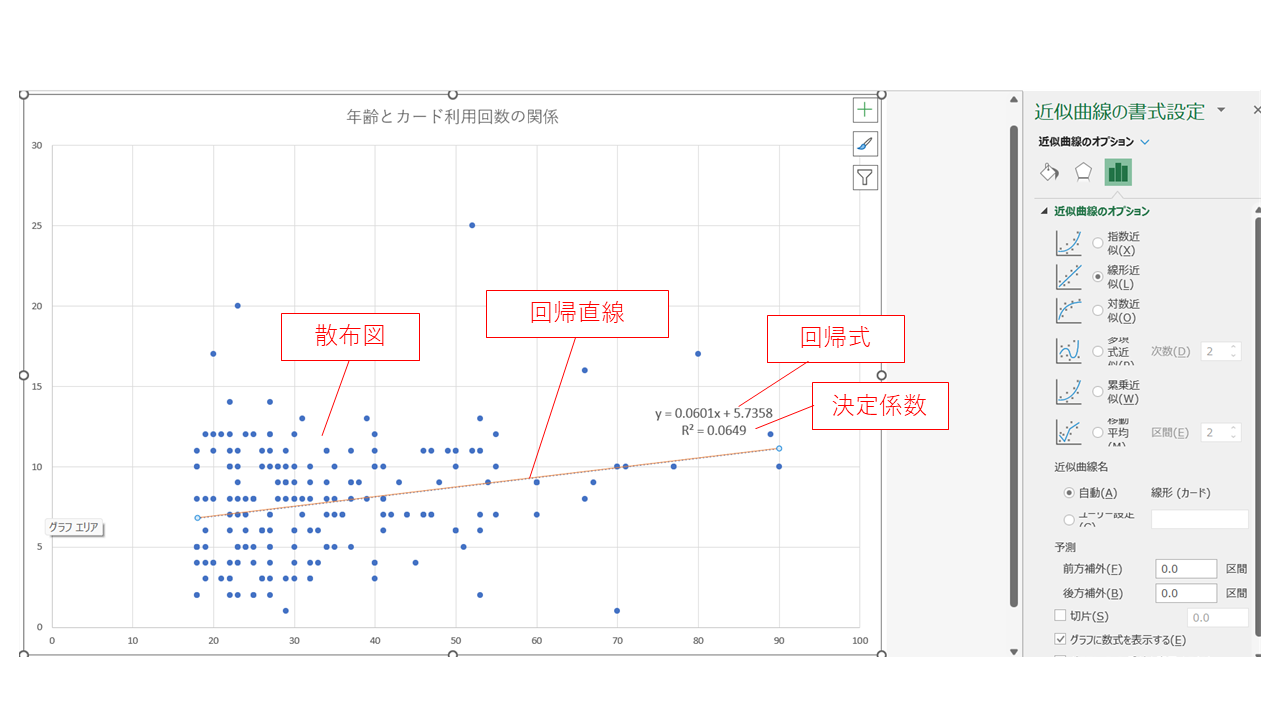
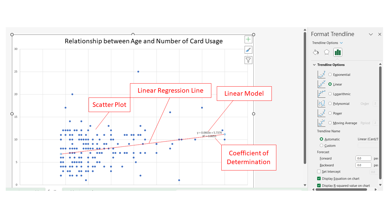
下の動画では回帰直線を作り,回帰式とR2を確認しています。動画のデータとみなさんのデータは違いますが,Excelの操作は同じです。グラフをクリックして(Win)+[プラス]印; (Mac)グラフ要素の追加から、近似曲線,近似曲線のオプションを「線形」にします。 書式設定でR2を表示させましょう。
In the video below, a regression line is created and the regression equation and R2 are shown. Although the data in the video and your data are different, how to do it with Excel is the asame. Click on the graph (Win) + [plus] sign; (Mac) From Add Chart Element, Trendline (Approximation Curve), set the option for Trendline to Linear. In the format selection, you can select R2.
R2は決定係数といい,変数の分散を説明できるほど大きな値になります。 決定係数 R2 = 0.0649 ということは,Xによって説明できるYのばらつきが全体の6.5%だという意味です。 極端な話、仮に各点が回帰線の上にぴったり載っていたとしたら,XによってYの値のばらつきをすべて説明できたということになり,その場合決定係数は1.00(100%)となるわけです。
R2 is called the coefficient of determination and indicates the proportion of the variance of Y explained by X. The coefficient of determination R2 = 0.0649 means that the variance of Y explained by X is 6.5% of the total. In the extreme case, if each point were exactly on the regression line, then X would explain all the variation in Y values, and the coefficient of determination would be 1.00 (100%).
それぞれの近似曲線の数式がどうなっているかも,グラフに数式を表示するにチェックを入れて確認することができます。動画では,グラフタイトルを「年齢とカード利用回数の関係」とし,ワークシート名をScatterにしました。 これで今回の散布図の完成です。
You can also check the Display Equations on chart to see what the equation looks like in the Trendline. In the video, the title ("Relationship between Age and Number of Card Usage") is added and the name of the worksheet ("Scatter") is added, too. This completes the scatterplot for this session.
単回帰場合の決定係数 R2 は,ピアソンの相関係数rの二乗となります。
The coefficient of determination R2 in simple regression is the square of Pearson's correlation coefficient r.
回帰係数bはβ1の推定値ですが,この場合のように回帰係数がr=0.06ぐらいでは,β1=0という帰無仮説通りの(つまり,回帰直線に傾きがない)母集団からかなりの確率で得られるような数値であるかもしれません。 ここで前回学んだt分布を応用し,β1=1の95%信頼区間に0が含まれれば,有意水準α=0.05で回帰係数(傾き)は統計的に有意とは言えないことがわかります。 以下ではPythonによる相関と線形回帰を紹介します。
The regression coefficient b is an estimate of β1, but as in this case, when the regression coefficient is around b=0.06, it may be obtained with a high probability from a population with β1=0, which is the null hypothesis (i.e., the regression line has no slope). Here, applying the t-distribution we learned last time, if the 95% confidence interval of β1=1 contains 0, we know that the regression coefficient (slope) is not statistically significant at the significance level α=0.05. Below, I will introduce correlation and linear regression with Python.
Mac/日本語
Win/English
10.3.4 Python による相関/Correlation in Python
ここでは,SQLで作成したinvoiceというテーブルをPythonで読み込んで,そのamountとdollarの相関を算出します。
Here, a table named invoice created in SQL is imported in Python and the correlation between its AMOUNT and DOLLAR is calculated.
Colabはマウントし(第6章参照),SQLiteと接続しておきます(第8章参照)。テーブルinvoiceの含まれるtrial.db(第7章参照))をColab Notebooksのdataに入れておきます。
Colab should be mounted (refer to Session 06) and connected to SQLite (refer to Session 08). Put into your Colab Notebooks the file "trial.db" containing the table "invoice" (refer to Session 07).
ライブラリpandasもpdというエイリアスで読み込み,そのread_sql関数でデータを読み込んだものをdf6というデータフレームに格納します(第5章参照)。下記はコード1です。
The library pandas is also imported with the alias pd (see Session 05), and use its function read_sql to import the data to be stored as a data frame "df6".The code below is code-1.
import sqlite3
import pandas as pd
conn = sqlite3.connect("/content/drive/MyDrive/Colab Notebooks/data/tool1.db")
query = "SELECT*FROM invoice;"
df6 = pd.read_sql(query, conn)
display(df6)
下記コード2は,queryやconnを用いて処理を分割しない場合のコードです。
Code-2 below is for the case where the process is not split using query or conn.
df6 = pd.read_sql('SELECT * FROM invoice;', sqlite3.connect("/content/drive/MyDrive/Colab Notebooks/data/tool1.db"))
display(df6)
df6ができたので,下記のコード3では,pandas.DataFrame.corrをデータフレーム型のオブジェクトであるdf6のメソッドに用いて,amountとdollar列の相関を算出します。
Now that we have df6, code-3 below uses pandas.DataFrame.corr as a method to a dataframe object df6, to compute the correlation between the amount and dollar columns.
r = df6["amount"].corr(df6["dollar"])
print(r)
10.3.5 Python による線形回帰/Linear Regression in Python
ここでは,第8章で可視化したペンギンのヒレの長さと体重の関係を回帰分析により検証します。
In this section, we use regression analysis to test the relationship between flipper length and body mass of penguins visualized in Session 08.
下記のコード4では,必要なライブラリやデータを読み込み,欠損値を削除して,ペンギンデータをdf2とします。
Code-4 below imports the necessary libraries and data, deletes the missing values, and stores the resulting penguin data in df2.
import pandas as pd
import numpy as np
import seaborn as sns
import matplotlib.pyplot as plt
!pip install japanize-matplotlib
import japanize_matplotlib
from sklearn.linear_model import LinearRegression
from sklearn.metrics import r2_score

df = sns.load_dataset("penguins")
df2 = df.dropna()
df2.head()
下記のコード5の回帰分析では,scikit-learnライブラリのLinearRegressionを使用します。
The regression analysis in Code-5 below uses LinearRegression from the scikit-learn library.
lr = LinearRegression()
x = df2[["flipper_length_mm"]].values
y = df2["body_mass_g"].values
lr.fit(x,y)
y_pred = lr.predict(x)
下記コード6で,回帰係数,切片,決定係数を表示させます。
Code-6 below displays the regression coefficient, the intercept, and the coefficient of determination are displayed
print("回帰係数 = ", lr.coef_[0])
print("切片 = ", lr.intercept_)
print("決定係数 = ", r2_score(y,y_pred))
print("Regression coefficient = ", lr.coef_[0])
print("Intercept = ", lr.intercept_)
print("Coefficient of determination = ", r2_score(y,y_pred))
下記のコード7では,最小二乗法のライブラリで主な統計量を表示します。
Code-7 below uses the library for OLS to display representative stats.
import statsmodels.api as sm
x2 = sm.add_constant(x)
est = sm.OLS(y, x2)
est2 = est.fit()
print(est2.summary())