03Excelによる探索的データ分析 / Exploratory Data Analysis with Excel
【目次/TOC】
3.1 Excelによる集計/Summarizing Data with Excel
3.1.1 Excel 関数を使った集計/Tabulation with Excel Functions

Excel の関数を使った集計として,すでに SUMIF を学びました。ここでは Excel のデータの要約に関して,COUNT, COUNTIF, AVERAGE,AVERAGEIF, そして空白セルの扱いについて説明します。データの個数 N,支店ごとの請求書の合計枚数,支店ごとの平均金額 を,関数を使って算出します。
We have already learned about aggregation using the SUMIF function in Excel. Here, I'll explain about summarizing data in Excel, including the use of COUNT, COUNTIF, AVERAGEIF, and handling blank cells. We'll calculate the total number of data N, the total number of invoices per branch, and the average amount per branch using functions.
こんなシチュエーションを想像してください。 みんなは今ある会社で働いていて,今日は上司から,各支店が請求書の内容を打ち込んだデータがあるけど,すべての支店の請求書は合計で何枚だった?と聞かれたとします。 この質問に回答するのが最初のタスクです。
Imagine a situation like this. You are working for a company and today your boss asks you, How many invoices did all the branches have in total? Your first task is to answer this question.
1枚の請求書のデータが1行になっているから,小さなデータだったら最後の行[ぎょう]を行番号を見ても早いよね。表の最後の行[ぎょう]に行くショートカットキーを覚えているかな? もうひとつの方法はCOUNT関数を使うことです。
Since one invoice uses one row, if the data is small, it is quicker to look at the last row. Do you remember the shortcut key to get to the last row of the table? Another way is to use the COUNT function.
COUNT関数は,範囲内の数値を含むセルの個数を返してくれます。任意のセルに,COUNT関数を入力し,引数に金額の範囲を選んでね。そうすると200という戻り値が返ってきます。 これがデータの個数,統計でいうNです。この場合,N=200です。下の動画を参考に,COUNT関数を実習しましょう。あなたは上司に,200枚です!と答えることができました。
The COUNT function returns the number of cells in the range that contain numbers. Enter the COUNT function in a cell and choose the range of Amounts as the argument. Then the return value of 200 will be displayed. This is the number of data, or N in statistics. In this case, N=200. Watch the video below, and practice the COUNT function. You would be able to reply to your boss, "There are 200 invoices in total.”
つぎに上司に,支店ごとの請求書はどこが多かった?と聞かれました。タスク(2)は,(2) 支店ごとの請求書の合計は何枚か?です。
支店名の度数表を作るのに、COUNTIF関数を使いましょう。
=COUNTIF(検索範囲, 検索条件)
で,指定した検索範囲にある検索条件の度数を数えてください.という関数になります。
検索条件が文字列のとき,文字列を"引用符"で囲むことを忘れないでね。下の動画を視聴して実習しましょう。
Say your boss asked you which branch got the highest number of invoices. Task 2 is to get the total number of invoices per branch.
Let's make a table of the frequencies of the branch codes using the COUNTIF function.
=COUNTIF(search range, search condition)
counts the number of times the search condition exists in the specified search range.
When the search condition is text, don’t forget to enclose the text in "quotation marks". Watch the video below and practice.
さらに上司に,請求書の平均金額はどの支店が一番高かった?と聞かれました。タスク(3)は,(3) 支店ごとの平均金額はいくらかです。 下の動画を見て実習を続けてね。まずは,支店ごとの合計金額を支店ごとの度数で割るという数式で平均金額を計算してみましょう。
You are further asked by your boss, Which branch had the highest average amount of invoices? This is Task 3: get the average amount per branch. Watch the video below to continue the practice. First, let's calculate the average amount by using the formula of dividing the total amount by the frequency of the branch.
そんな割り算をせずに,AVERAGEIF関数でいっぺんに実行することもできます。 =AVERAGEIF(条件について見る範囲, 条件,平均する範囲) という関数です。
Instead of using such a division, you can use the AVERAGEIF function.
=AVERAGEIF(range to look at for a condition, condition, range to average)
数式を使った結果と,関数を使った結果で,計算結果は同じに見えるけど,関数を使うことがお薦めです。なぜかというと,空白のセルの扱いが違うからです。
Although the calculation results look the same between the one using Formulas and the other using Functions, it is recommended to use functions. The reason is that the treatment of blank cells is different.
動画では引き続き, 空白のセルの扱いのデモンストレーションのために,ためしに福岡の金額データをひとつ消去しています。 その結果,数式で入力した方の平均値は変わりましたが、AVERAGEIF関数の平均値は減りません。なぜでしょうか?
To demonstrate the treatment of blank cells, one of the Fukuoka amount data is deleted in the video. As a result, the average value by the formula became smaller than the average value by AVERAGEIF. Why?
あ,これから解説するけど,その前に,実習のために試しに消去したデータを,アンドゥで忘れずに戻しておいてね!
Well, I'm going to explain in a moment, but before that, don't forget to Undo the erase and to restore the data that you just deleted for the practice!
空白セルの扱いを解説します。基本Excelは空白セルを0として扱うため,数式の方では平均値が小さくなりました。 でも関数によっては,空白セルを,計算に入れない欠損値と認識して無視してくれます。この場合はそのケースです。 AVERAGEIF関数のリンク先の「解説」を見てください。「平均範囲内の空白のセルは無視されます。」とあります。しかし関数だからといって、すべての空白セルを一律に無視するわけでもありません。同じ「解説」には,「条件」範囲内の空白のセルは 0 と見なされるとあります。
Treating Blank Cells. Basically, Excel treats blank cells as 0, so the formulas have a smaller average value. But some functions recognize blank cells as missing values and won’t include them in the calculation. This is the case here. See the "Remarks" in the AVERAGEIF function. It says "If a cell in average_range is an empty cell, AVERAGEIF ignores it." However, just because it is a function does not mean that all blank cells are uniformly ignored. The same "Remarks" states "If a cell in criteria is empty, AVERAGEIF treats it as a 0 value."
このように,関数は,空白を0とみなすか,空白を欠損値とみなして無視するか,その機能に合わせて適切に判断するよう便利に作られているので,関数があるのであれば,それを使いましょう。
In this way, a function is conveniently designed to determine whether blank cells should be regarded as 0 or ignored as a missing values, as appropriate for the function, so if there is a function, use it.
3.1.2 Excel テーブル/Excel Table
上のセクションでは,Excelのセル範囲の中で,関数を使って統計量を算出しました。 このセクションでは,テーブルを使います。 ウィンドウ枠を固定しないでテーブルのずっと下に行っても,列のタイトル行が見えていたら、それはテーブルです。テーブルではない,今まで使っていたふつうのセルの部分をExcelではセル範囲といいます。
Up to the section above, we used functions to calculate statistics in the Excel cell range. In this section, you will use table. If you scroll down the table without using “Freeze Panes” and you still see the title row of the columns, it is a table. In contrast to table, the regular cells that you have been using are called range in Excel.
テーブルのすごいところは,Excelがテーブルを認識してくれること。 今回は,テーブルが新たな列を認識したり,集計してくれたりすることを実習で体験します。それでは,下の動画を観ながら実習してみましょう。 学籍番号のファイルのInput Dataシートの生データ部分を、新しいシートであるTableに貼り付けてね。
The great thing about table is that Excel recognizes them. In this hands-on practice, you will see how the table recognizes new columns or can total values. Let's watch the video below and practice. In the student ID file, please paste the raw data part in the "Input Data" worksheet into the new worksheet "Table".
テーブル作成には,主に3つのやり方があります。(1) リボンの「ホーム」から「テーブルとして書式設定」,(2) リボンの「挿入」から「テーブル」を選ぶ, (3) ショートカットキーでCtrl+T (Windows); command+T (Mac) 。 「テーブル」シートの,入力セルのどこでもよいのでクリックして、(1)~(3)のどれかの操作をしてね。動画でのちかちゃんはショートカットキーを使い,範囲でOKを押しています。
There are mainly three ways to create a table. (1) "Format as Table" from the "Home" ribbon, (2) "Table" from the "Insert" ribbon, and (3) shortcut keys Ctrl+T (Windows); command+T (Mac). On the "Table" sheet, click anywhere in the copied cell and do one of the operations above. Chika-chan in the video uses shortcut keys and presses OK on the range.
「データ」に入っている CopyFromHere03.xlsx の,「カード」・「車種」・「エンジン」・「車体」・「外装」・「足回り」・「保安」の7列を学籍番号ファイルの「テーブル」の横に貼り付けてください。Excelが瞬く間ににテーブルのつづきと認識して,同じテーブルの一部となります。
Please find CopyFromHere03.xlsx. Paste the seven columns "Card", "Model", “Engine”, “Body”, “Exterior”, “Suspension”, and “Security” next to the "Table" in your student ID file. Excel instantly recognizes it as a continuation of the table and makes it part of the same table.
テーブルの中のセルをクリックすると,リボンにテーブルデザインが表れ,外をクリックするとテーブルデザインが消えます。動画のちかちゃんはテーブルデザインをクリックして,縞模様をなくしました。みんなも,自分の好きなデザインを選んでください。 そして,集計行にチェックを入れると,最下行に集計行が追加されます。 集計行のセルをクリックすると,ドロップダウンリストから好きな基本統計量を選ぶことができます。簡単ですね!
If you click on a cell inside the table, Table Design will appear on the ribbon, and clicking outside the table design makes it disappear. Chika-chan in the video clicked on Table Design and selected a design without stripes. You can choose your own design. Check the Total Row checkbox in Table Design to add a total row to the bottom. When you click on a cell in the total row, you can choose a summary statistic from the drop-down list. It's that easy!
テーブル形式から抜け出してふつうのセルに戻りたいときには,テーブルデザインの範囲に変換を選びます。範囲に変換すると、集計行のドロップダウンリストがなくなるので、注意してね。リボンにテーブルデザインもありません。 テーブルには,またいつでも変換することができるので,つぎの実習に移る前に「テーブル」シートのテーブルを範囲に変換したままにしておいてね。
If you want to get out of table and back into a regular cell range, choose Convert to Range in Table Design. Note that when you convert to a range, you lose the drop-down list of the total row. There is also no Table Design on the ribbon. You can always convert it back to a table again. Be sure to leave the table converted to a range before moving on to the next practice.
3.1.3 Excel ピボットテーブル/Excel PivotTable
つぎにセル範囲からピボットテーブルにする変換する方法です。
(1) ピボットテーブルにしたいセル範囲内のセルを選びます。
(2) リボンの「挿入」からピボットテーブルを選び,作成したい場所を選んで「OK」。新しいワークシートの名前を付けます。
(3) ピボットテーブルのフィールド」で,列にしたい変数のチェックボックスに チェックを入れます。
(4) 右下の「値」▼で各変数をクリックし,「値フィールドの設定」から,表示させ たい集計値(「平均」など)を選んでピボットテーブルのセルに表示させます。
(5) 列名から行にしたい列をドラッグして「行」に入れます。
(6) 小数点を揃えるなど整えたらピボットテーブルの完成です。
The next step is to convert a range of cells to a pivot table.
(1) Select the cells in the cell range that you want to turn into a pivot table.
(2) Select Pivot Table from "Insert" on the Ribbon, choose the location where you want to create the pivot table, and click "OK. Name the new worksheet.
(3) In "Pivot Table Fields," check the checkboxes for the variables that you want to be columns.
(4) Click each variable in the "Value" ▼ in the lower right corner, and from the "Value Field Settings," select the aggregate value you want to display (e.g., "Average") and display it in the cell of the pivot table.
(5) Drag the column you want to make into a row from the column name and put it into "Rows.
(6) After adjusting the decimal points, etc., the pivot table is complete.
可視化とはデータをグラフなどで表すこ とを指し,それにより視覚的にパターンを把握します。ここではひとつの変数の値がどの ように分布しているか,量的データの分布を見るのに使われるヒストグラム,質的データ については円グラフで値の分布を可視化をしましょう。この 2 つを,ヒストグラムは基本 のグラフ,円グラフはピボットグラフで描くことによって,Excel のこれらのグラフの機能を解説します。
Visualization is the process of representing data in graphs and other graphical formats to visually grasp patterns. In this section, we will visualize the distribution of values of a variable by using a histogram, which is used to see the distribution of quantitative data, and a pie chart for qualitative data. We will explain the functions of these graphs in Excel by drawing a basic graph for the histogram and a pivot graph for the pie chart.
3.2 Excelによる可視化/Visualization with Excel
3.2.1 ヒストグラム/Histogram
それでは,1つの量的変数の値の分布を可視化する基本のグラフであるヒストグラムを 作成します。量的データの例として年齢をとり あげます。
We will now create a histogram, which is a basic graph to visualize the distribution of values of a quantitative variable. As an example of quantitative data, let's take age.
それでは下の動画に従って実習をします。自分の学籍番号ファイルを開けてね。動画では,作業しやすいように数式バーの広さを白い上下矢印のカーソルで調整したり,ズームスライダーで表示を拡大したりしています。 Ageのセル範囲をショートカットキーで選択し,リボンの「挿入」 > グラフ > 統計グラフの挿入 > ヒストグラムをクリックします。
Now follow the video below to do the practice. Open your own student ID file. In the video, to make it easier to work with, the hight of the formula bar is adjusted with the white up/down arrow cursors and the zoom slider is used to enlarge the display. Select the Age cell range with the shortcut keys and click on the Ribbon Insert > Charts > Insert Statistic Chart > Histogram.
ヒストグラム自体を新しいワークシートにしたいので,出現したヒストグラムの中をクリックしてリボンに「グラフのデザイン」を出して,「グラフの移動」 > 「新しいワークシート」 > ワークシートの名前を「ヒストグラム」にして移動させましょう。 動画ではワークシート自体をタブをドラッグして位置を一番左側にしていますが,ここはやってもやらなくても構いません。
Since we want the histogram to be in a new worksheet, let's move it by clicking inside the histogram to bring up "Chart Design" on the Ribbon, and then choose "Move Chart" > "New Worksheet" > Name Worksheet "Histogram". In the video, the worksheet is positioned to the leftmost side by dragging the tab, but this is optional.
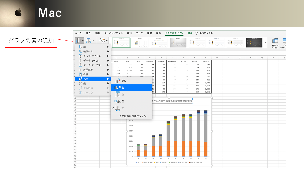
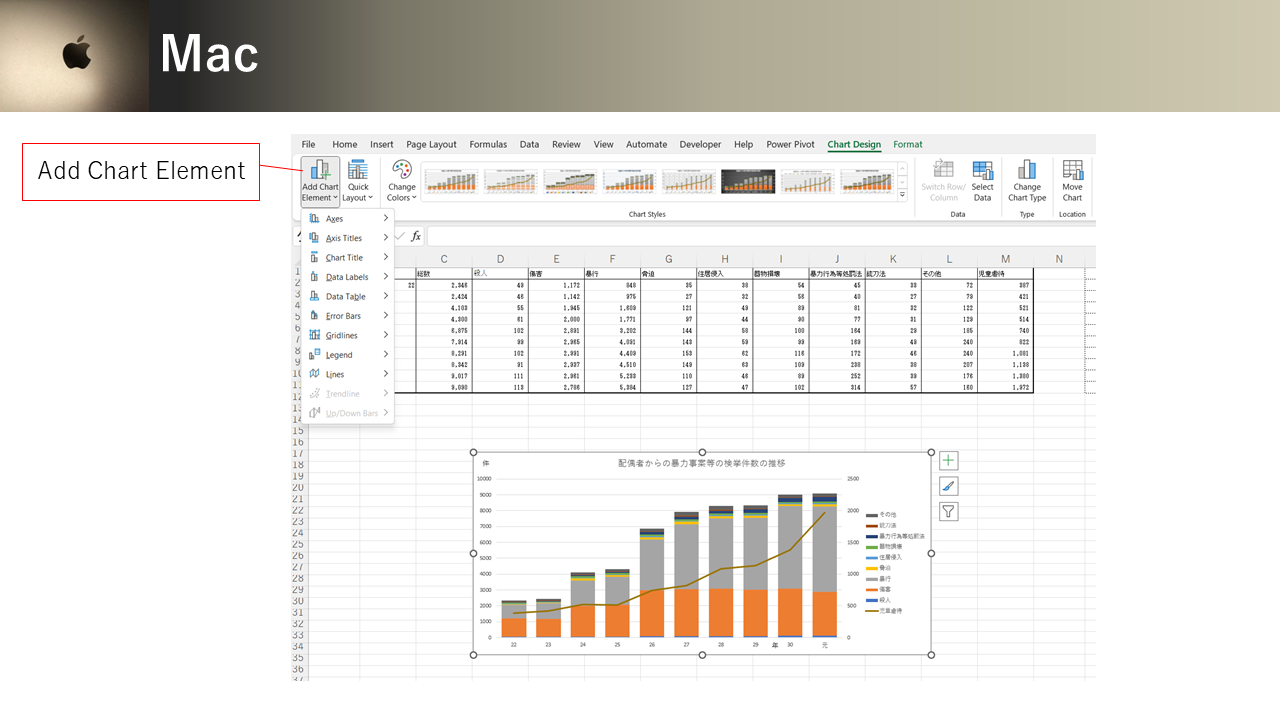
横軸を10歳代,20歳代,・・・60歳代以上に分けるのに,「軸の書式設定」ウィンドウを出します。 グラフの中をクリック > +印 > 「軸」 > 「その他の軸オプション」で軸の書式設定ウィンドウを開いても,グラフの横軸を右クリックして軸の書式設定ウィンドウを開いても良いですし,ショートカットキーでCtrl + 1 (Win); ⌘command + 1 (Mac)でも書式設定のウィンドウが開きます。 Macでは下記の画像のように グラフのデザイン>グラフ要素を追加>軸>その他の軸オプション も試してみてください。
To divide the horizontal axis into the 10s, 20s, ... and 60s & above, bring up the "Format Axis" window. You can open the axis Format pane by clicking inside the chart > + sign > "Axis" > "More Axis Options", by right-clicking on the horizontal axis of the chart, or by using the shortcut keys Ctrl + 1 (Win); ⌘command + 1 (Mac) to open the Format pane and choose from Options. In Mac, try also Chart Layouts > Add Chart Element > Axis > More Axis Options as shown in the image below.
「軸の書式設定」 > 「軸のオプション」 > 「ビンの幅」 で,ヒストグラムの横幅を選びます。この場合は10に設定します。 「ビンのアンダーフロー」では,入力値以下をヒストグラムの一番左のビンとして設定します。この場合,10歳代なので19に設定します。「ビンのオーバーフロー」では,入力値より大きいをヒストグラムの一番右のビンとして設定します。 この場合は60歳代以上をまとめたいので,59に設定して,59歳より大きい値(つまり60歳以上)が一番右側のビンになるようにします。
In Format Axis > Axis Options > Bin width, select the width of the histogram. In this case, set it to 10. Under "Underflow bin," set the input value and below as the leftmost bin in the histogram. In this case, set it to 19 because the leftmost bin should be the teens. "Overflow bin" sets the right-most bin for all the values greater than the input value. In this case, we want to group the 60+ age group together, so we set the value to 59, so that values greater than 59 (i.e., 60 and over) will be in the right-most bin.
カードの使用年齢ですので,左側は18歳で打ち切りになっていますが,それを考慮しても20歳代の使用が多く,左に歪んだ分布になっています。この形は正の歪度[わいど]といいます。逆に右に歪んだ分布は歪度が負となります。 左右対称の分布の場合は歪度が0[ゼロ]です。
Since this variable is for the age of card use, the left-hand side of the distribution is terminated at age 18, but even taking this into account, most of the card users are in their 20s, resulting in a distribution skewed to the left. This shape is called positive skewness. Conversely, a distribution skewed to the right has a negative skewness. In the case of a symmetrical distribution, the skewness is 0.
タイトルの部分をクリックして「年齢のヒストグラム」というタイトルにします。
Click on the title and title it "Histogram of Age".
動画ではデモンストレーションとして色を変えたり、スタイルを変えたりしています。みなさんも自分の好きなスタイルにしてください。
In the video, I changed the color and style as a demonstration. You can also style it any way you like.
+印からデータラベルのオプションも確認しましょう。 ちかちゃんの選んだスタイルではタイトルの色を白にした方が読みやすいので,動画では文字色を白にして太字に変えています。
Also check the data label options from the + sign. In the style Chika-chan chose, it is easier to read the title in white, so in the video, the text color is changed to white and bold.
3.2.2 円グラフ/Pie Chart
つぎに1つの質的変数の値の分布(比率)の可視化に用いられる円グラフを,Excel の ピボットグラフで作成,編集していく方法を紹介します。
Next, we will show how to create and edit a pie chart used to visualize the distribution of values (ratio) of a qualitative variable using Excel's pivot graph.
車種A~車種Jという質的変数の値の分布を把握する円グラフを実習で作成しましょう。
車種Aに1,車種Bに2と数字で値を与えたとしても,車種B=2が車種A=1の2倍であるということではなく,その数値は四則演算用の数字ではなく,どの車種かを指すだけの数値なので,質的変数です。
ここでのタスクは,テーブルシートの「車種」列から,どの車種がどの比率でレンタルされているかを把握することです。
集計をしてからグラフ化するには,ピボットテーブルとピボットグラフを使います。
この場合,生データから度数分布表をピボットテーブルで集計して,それをピボットグラフにします。ピボットグラフは,基本のグラフとほぼ同様に編集できますが,違いは大きく3つあります。
Let's create a pie chart to visualize the distribution of values of qualitative data from car type A to car type J in a practice.
Even if we give a numerical value of 1 for car model A and 2 for car model B, it does not mean that car model B=2 is twice as large as car model A=1. These are qualitative data and they are not numbers for the four arithmetic operations, only numbers that refer to categories (car models).
The task here is to figure out from the "Model" column of the table sheet which car type is being rented and by what percentage.
To summarize and create a chart, we use a pivot table and a pivot chart.
In this case, a frequency distribution table is compiled from the raw data in a pivot table, which is then turned into a pivot chart. Pivot charts can be edited in much the same way as basic charts, but there are three main differences.
ピボットグラフの基本グラフとの違いの第1は,ピボットグラフとピボットテーブルは自動連携していて,どちらかのデータを変えると,自動的に他方に反映されることです。
第2に,ピボットテーブルはテーブル全体が1つのテーブルと認識されてピボットグラフと対応しているので,ピボットテーブルの一部だけをピボットグラフ化することはできないことです。
第3に,ピボットグラフにはフィールドボタンが表示されて,そのボタンからインタラクティブにグラフを操作できるところです。
The first difference between PivotChart and basic Chart is that a PivotChart and a PivotTable are automatically linked, so changing data in one automatically reflects it in the other.
Second, a PivotTable is recognized as a whole table and corresponds to a PivotChart, so it is not possible to make only a part of the PivotTable into a PivotChart.
Third, PivotChart displays field buttons that allow you to interactively manipulate the chart.
それでは,下の動画を観ながらピボットグラフで円グラフを作ってみましょう。まず車種のデータを選び,第3回で学んだように,ピボットテーブルを新規ワークシートに作成し,(Macは特に)挿入のピボットグラフをクリック。
これはピボットグラフではない基本のグラフでも同じ編集操作ですが,値を入れるのに、クイックレイアウトから選べること,自分好みにするために、値ラベルを書式設定パネルから指定する方法を示しています。今回は,値ラベルの表示を,書式設定パネルから値と%を改行で表示するよう指定します。
Now, let's create a pie chart with PivotChart while watching the video below. First, select the Model data, create a pivot table in a new worksheet like you learned in the third session, and click (especially for Mac) insert PivotChart.
Editing operations for PivotChart is much the same way as basic Chart, but it shows you that you can choose from Quick Layout to insert values, and how to specify value labels from the Formatting panel to make it your own. In this case, we will specify the value labels to be displayed with the value and % on a new line from the formatting panel.
動画では,フィールドボタンの中身を確かめたのち,フィールドボタンを消す操作をしています。特定のフィールドボタンを消すには、ピボットグラフ分析リボンのフィールドボタンの下から選びます。すべてのフィールドボタンを一気に消すには、フィールドボタンアイコンをクリックします。
円グラフを作ったシート名を「円グラフ」にしましょう。必要に応じて,テキストボックスを補足します。たとえばデータの総数をN=で示しておきましょう。この場合,N=200ですね。
In the video, Chika-chan checked the contents of the field buttons and turned them off. To turn off a specific field button, choose it from under Field Buttons on the PivotChart Analyze ribbon. To turn off all field buttons at once, click on the Field Buttons icon.
Name the sheet "Pie Chart". Supplement the text boxes as needed. For example, let the total number of data be indicated by N=. In this case, N=200.
つぎに1つの質的変数の値の分布(比率)の可視化に用いられる円グラフを,Excel の ピボットグラフで作成,編集していく方法を紹介します。
Next, we will show how to create and edit a pie chart used to visualize the distribution of values (ratio) of a qualitative variable using Excel's pivot graph.
車種A~車種Jという質的変数の値の分布を把握する円グラフを実習で作成しましょう。 車種Aに1,車種Bに2と数字で値を与えたとしても,車種B=2が車種A=1の2倍であるということではなく,その数値は四則演算用の数字ではなく,どの車種かを指すだけの数値なので,質的変数です。 ここでのタスクは,テーブルシートの「車種」列から,どの車種がどの比率でレンタルされているかを把握することです。 集計をしてからグラフ化するには,ピボットテーブルとピボットグラフを使います。 この場合,生データから度数分布表をピボットテーブルで集計して,それをピボットグラフにします。ピボットグラフは,基本のグラフとほぼ同様に編集できますが,違いは大きく3つあります。
Let's create a pie chart to visualize the distribution of values of qualitative data from car type A to car type J in a practice. Even if we give a numerical value of 1 for car model A and 2 for car model B, it does not mean that car model B=2 is twice as large as car model A=1. These are qualitative data and they are not numbers for the four arithmetic operations, only numbers that refer to categories (car models). The task here is to figure out from the "Model" column of the table sheet which car type is being rented and by what percentage. To summarize and create a chart, we use a pivot table and a pivot chart. In this case, a frequency distribution table is compiled from the raw data in a pivot table, which is then turned into a pivot chart. Pivot charts can be edited in much the same way as basic charts, but there are three main differences.
ピボットグラフの基本グラフとの違いの第1は,ピボットグラフとピボットテーブルは自動連携していて,どちらかのデータを変えると,自動的に他方に反映されることです。 第2に,ピボットテーブルはテーブル全体が1つのテーブルと認識されてピボットグラフと対応しているので,ピボットテーブルの一部だけをピボットグラフ化することはできないことです。 第3に,ピボットグラフにはフィールドボタンが表示されて,そのボタンからインタラクティブにグラフを操作できるところです。
The first difference between PivotChart and basic Chart is that a PivotChart and a PivotTable are automatically linked, so changing data in one automatically reflects it in the other. Second, a PivotTable is recognized as a whole table and corresponds to a PivotChart, so it is not possible to make only a part of the PivotTable into a PivotChart. Third, PivotChart displays field buttons that allow you to interactively manipulate the chart.
それでは,下の動画を観ながらピボットグラフで円グラフを作ってみましょう。まず車種のデータを選び,第3回で学んだように,ピボットテーブルを新規ワークシートに作成し,(Macは特に)挿入のピボットグラフをクリック。 これはピボットグラフではない基本のグラフでも同じ編集操作ですが,値を入れるのに、クイックレイアウトから選べること,自分好みにするために、値ラベルを書式設定パネルから指定する方法を示しています。今回は,値ラベルの表示を,書式設定パネルから値と%を改行で表示するよう指定します。
Now, let's create a pie chart with PivotChart while watching the video below. First, select the Model data, create a pivot table in a new worksheet like you learned in the third session, and click (especially for Mac) insert PivotChart. Editing operations for PivotChart is much the same way as basic Chart, but it shows you that you can choose from Quick Layout to insert values, and how to specify value labels from the Formatting panel to make it your own. In this case, we will specify the value labels to be displayed with the value and % on a new line from the formatting panel.
動画では,フィールドボタンの中身を確かめたのち,フィールドボタンを消す操作をしています。特定のフィールドボタンを消すには、ピボットグラフ分析リボンのフィールドボタンの下から選びます。すべてのフィールドボタンを一気に消すには、フィールドボタンアイコンをクリックします。 円グラフを作ったシート名を「円グラフ」にしましょう。必要に応じて,テキストボックスを補足します。たとえばデータの総数をN=で示しておきましょう。この場合,N=200ですね。
In the video, Chika-chan checked the contents of the field buttons and turned them off. To turn off a specific field button, choose it from under Field Buttons on the PivotChart Analyze ribbon. To turn off all field buttons at once, click on the Field Buttons icon. Name the sheet "Pie Chart". Supplement the text boxes as needed. For example, let the total number of data be indicated by N=. In this case, N=200.
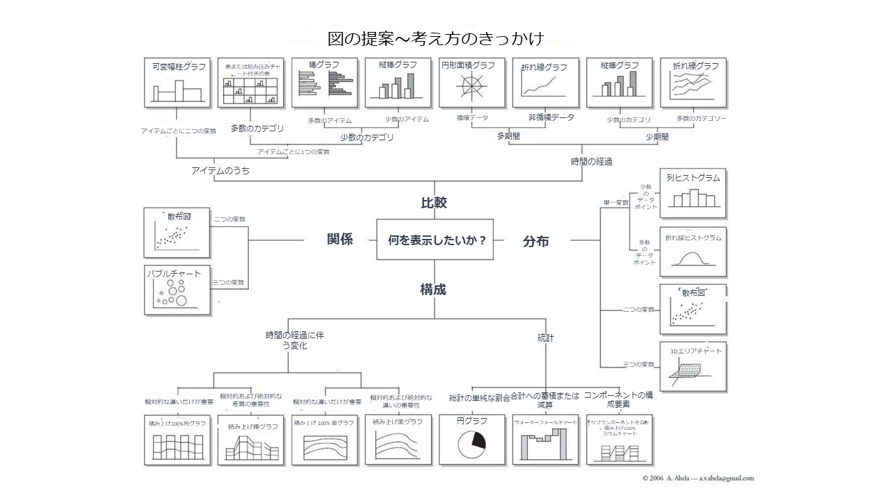

上の図は,何を示したいときにどのグラフを使えばよいかというチャートで,アメリカの大学などでよく使われています。今後はcopilotのように,図の作成はAIが指示通りに作成してくれるようになるでしょう。今後必要になってくるのは,どういうときにどのような図を作るのが適切かという判断になることと思います。 このグラフの上右下左に示されているように,グラフで示したいことには大きく分けて,比較,分布,構成比,関係の4つがあります。ここまではExcelの基本の図とピボットグラフを紹介するのに,分布からヒストグラム,構成比から円グラフを紹介しました。つぎに比較の中で推移を把握する,棒グラフ・折れ線グラフ,スパークライン,トレンドラインを中村先生が紹介してくれます。中村先生,よろしくお願いします!

The figure above is a chart often used by universities in the United States that shows which chart to use for what. In the future, charts will be created as instructed by AI like copilot. What will become necessary in the future will be to judge what kind of charts are appropriate in what case. As shown in the four directions in this chart, there are four major types of charts that can be used to show Comparison, Distribution, Composition, and Relationship. So far, I have introduced Histogram for distribution and Pie Chart for Composition to show how to use the basic Charts and PivotChart. Below, Nakamura-sensei will explain how to visualize Comparisons Over Time by Combo Chart of Column Bar and Line Charts Sparkline, and Trendline.
3.2.3 積み上げ棒グラフ・折れ線グラフの作成と編集/Combo of Bar and Line Charts

こんにちは!中央大学総合政策学部の中村周史です。それでは早速はじめましょう。比較の中で推移を把握する,積み上げ棒グラフと折れ線グラフの組み合わせグラフについて動画で説明します。
Hello! I am Chikafumi NAKAMURA, the Faculty of Policy Studies, Chuo University. Let's get started. The video below shows how to visualize Comparisons Over Time by a Combo chart of stacked column bar chart and line chart.
For English subtitles in YouTube
Click on the gear button for "Settings" > Subtitles > Auto-translate > Choose "English" -> Click on CC Button for Subtitles/closed captions
3.2.4 スパークライン/Sparklines
積み上げ棒グラフでは全体の傾向を把握することができましたが,項目ひとつひとつの推移を探索的に可視化したい場合にはスパークラインが便利です。
While the stacked column chart allowed us to grasp the overall trend, Sparklines are useful when we want to exploratively visualize the transition of individual item.
For English subtitles in YouTube
Click on the gear button for "Settings" > Subtitles > Auto-translate > Choose "English" -> Click on CC Button for Subtitles/closed captions
3.2.5 比較(推移)の応用:トレンドライン/Applied Comparison Over Time: Trendlines
では,他の条件が同じで今のままの推移の傾向が続いた場合の予測であるトレンドライン(近似曲線)を作成しましょう。
Now let's create a trend line that can be used for forecast if the trend continues as it is now, other conditions being equal.
For English subtitles in YouTube
Click on the gear button for "Settings" > Subtitles > Auto-translate > Choose "English" -> Click on CC Button for Subtitles/closed captions
3.2.6 地図/ Map (Demonstration)
ここからは,おまけのデモンストレーションです。まずは地図の作成です。新型コロナの2021年4月25日の都道府県別人口100万人あたりの感染者数のデータをちかちゃんが塗り分けマップにする操作を見せています。動画内のデータは,札幌医科大学医学部 附属フロンティア医学研究所 ゲノム医科学部門のまとめを出典としています。
The followings are other charts for demonstration. The video below shows Chika-chan creating Filled Map from the data of the number of Covid-19 infections per million population by prefecture as of April 25, 2021. The data source is this site.
3.2.7 スライサー,条件付き書式/Slicer, Conditional Formatting
3.2.8 マクロ・VBAを少しだけ織り交ぜて,棒グラフレースのデモンストレーション/Demonstration of Bar Chart Race with Macro/VBA
最後に,棒グラフレースのデモンストレーションです。 棒グラフレースでは,Excelのマクロという機能を使っています。マクロには,VBA (Visual Basic for Applications)というプログラミング言語が使われています。
Finally, a demonstration of Macro/VBA to create a bar chart race. In the bar chart race, we will use a feature called Macro in Excel. Macros use a programming language called VBA (Visual Basic for Applications).
Sub RaceBar()
'年次変化を棒グラフで辿る
Dim nCount As Integer
For nCount = 2010 To 2019
DoEvents
ActiveWorkbook.Worksheets("棒グラフレース").Range("N3") = nCount
'動きが速すぎる場合,下の1行を追加して1秒ずつ変化させることもできる。1秒でなくても、時間は自分で指定可能。
Application.Wait (Now + TimeValue("0:00:01"))
DoEvents
DoEvents
Next
End Sub
Sub RaceReset()
'西暦を2010 に戻す
ActiveWorkbook.Worksheets("棒グラフレース").Range("N3") = 2010
End Sub
Sub RaceBar()
'Tracing annual changes of bar chart.
Dim nCount As Integer
For nCount = 2010 To 2021
DoEvents
ActiveWorkbook.Worksheets("Bar Chart Race").Range("N3") = nCount
'If the movement is too fast, you can add a line below to change it by one second; if not one second, you can specify the time yourself.
Application.Wait (Now + TimeValue("0:00:01"))
DoEvents
DoEvents
Next
End Sub
Sub RaceReset()
'Reset Year to 2010
ActiveWorkbook.Worksheets("Bar Chart Race").Range("N3") = 2010
End Sub