08Pythonによる探索的データ分析 / Exploratory Data Analysis with Python
【目次/TOC】
1. 配列とデータフレームの操作/Manipulation of Arrays and Data Frames
8.1.1 NumPy

本ウェブページは『超入門 はじめてのAI・データサイエンス』第8章に記載されたコードを埋め込んでいます。第4章で使い方を学んだColab上で,Pythonによる探索的データ分析を行います。最初はNumPyライブラリを用いた配列に関するコードです。下記コード1では,NumPyライブラリを読み込み,二次元のndarrayを作成します。
This webpage corresponds to Session 08 of the English website. On Colab, which you learned how to use in Session 04, you will perform exploratory data analysis in Python. First, we will look at codes related to arrays using the NumPy library. The following code-1 imports NumPy and creates two-dimensional ndarray.
import numpy as np
a = np.array([[1,2,3],[4,5,6]])
a
コード2は,aという行列オブジェクトの形状を返します。
The following code-2 ruturns the shape of a matrix object "a".
a.shape
下記コード3は,すべての要素に1が入った,引数により指定する形状の行列を作ります。NumPyのonesについてもっと知りたい人はこちらを参照して下さい。
Code-3 below creates a matrix of the shape specified by the argument, with each element of it as 1. If you would like to learn more about NumPy ones, please click here.
b=np.ones((2,3))
b
下記コード4では,累算代入演算子を用いて,行列bを定数倍したものを,bに上書きしています。
In code-4 below, the matrix b is overwritten with a scalar multiple of b using a cumulative assignment operator.
b*=10
b
下記コード5は,bのデータの型を返します。
Running code-5 below will return the type of b.
b.dtype
下記コード6は,行列bの型を変換するコードの例です。
Code-6 below is an example of converting the type of matrix b.
b = b.astype(int)
b
下記コード7は,行列加算のコード例です。
Code-7 below is an example code of matrix addition.
a + b
下記コード8は,配列の形状変換の例です。
Code-8 below is an example of giving a new shape to an array.
c = a.reshape(3,2)
c
コード9は,行列cの各要素に6を足すコードです。
Code-9 is a code that adds 6 to each element of matrix c.
c = c + 6
c
下記コード10は,行列の積を返すコードです。
Code-10 below is a code that returns the result of matrix multiplication.
d=np.dot(a,c)
d
下記コード11は,行列の要素積を返すコードです。
Running code-11 below will return the result of the Hadamard product.
e = a * b
e
下記コード12では,配列eの平均を返します。
Running code-12 below will return the mean of array e.
e.mean()
下記コード13は,配列eのaxis=0,縦方向の平均を返します。
Running code-13 below will return the mean of the values vertically across rows.
e.mean(axis=0)
下記コード14は,配列eのaxis=0,横方向の平均を返すコードです。
Code-14 below is a code that returns the mean of the values horizontally across columns.
e.mean(axis=1)
8.1.2 Pandas
ライブラリpandasは,通常下記コード15のようにエイリアスpdを付けて読み込みます。第6章でも用いましたし,データ分析には欠かせないライブラリです。これからも事あるごとに使っていきます。
The library pandas is usually imported with the alias pd, as in code-15 below. We used it in Session 06 and it is an indispensable library for data analysis. We will keep using it as needed.
import pandas as pd
2.Matplotlibによる可視化/Visualization with Matplotlib
8.2.1 Matplotlib の図の構造・種類・オプション/Structure, Type, and Option of Plots with Matplotlib
下記コード16では,Pythonの可視化ライブラリであるMatplotlibのpyplotモジュールを読み込みます。pyplotのsubplot関数で現在のFigureにAxesを準備します。
Use code-16 below to import the pyplot module of Matplotlib, a Python visualization library. The subplot function of pyplot prepares Axes for the current Figure.
import matplotlib.pyplot as plt
plt.subplots()
Matplotlibで日本語を使えるようにする方法の中で,下記のコード17は外部ライブラリを用いる方法です。3つあるコードのうち,1つ目がインストール,2つ目が読込のためのコード,ここまでで日本語を使うことができなかったら、3つ目の日本語フォントのための付加的なコードも実行してください。
Among the ways to employ Japanese in Matplotlib, code-17 below uses an external library. Of the three codes, the first is for installation, the second for importing, and if you cannot use Japanese at this point, run the third additional code for Japanese fonts.
!pip install japanize-matplotlib
import japanize_matplotlib
plt.rcParams["font.family"]="Hiragino Maru Gothic Pro"
plt.rcParams["font.family"]="IPAexGothic"
下記コード18は書籍 p.112 図8.1の散布図を表示するコードです。
Code-18 is to display the scatter plot shown in Figure 8.1.
g=np.array([3,4,5,5,6,7,7,8])
h = np.array([2,4,4,6,5,5,7,9])
plt.scatter(g, h)
plt.title("図タイトル")
plt.xlabel("X軸ラベル")
plt.ylabel("Y軸ラベル")
plt.show()
g=np.array([3,4,5,5,6,7,7,8])
h = np.array([2,4,4,6,5,5,7,9])
plt.scatter(g, h)
plt.title("Figure Title")
plt.xlabel("X Axis Label")
plt.ylabel("Y Axis Label")
plt.show()
8.2.2 データの探索/Exploring Data
コード19は,pyplotに続けて,ペンギンデータセットの入った可視化ライブラリ seaborn を読み込みます。
Code-19 is to import pyplot and seaborn, a visualization library that has "penguins" dataset in it.
import matplotlib.pyplot as plt
import seaborn as sns
コード20は,ペンギンデータセットを読み込んでデータを確認する例です。
Code-20 is an example of importing penguin dataset and taking a look at the data.
df=sns.load_dataset("penguins")
df.head()
コード21はデータ情報を得る別の方法です。
Code-21 is another way of getting information of data.
df.info()
コード22では,ペンギンデータセットの2つの文字列データについて調べています。
Code-22 is to look into two string data in "penguins" dataset.
print(df["species"].unique())
print(df["island"].unique())
8.2.3 量的変数の関係の可視化: 散布図/Visualizing the Relationships of Quantitative Variables: Scatter Plots
ペンギンのヒレの長さと体重の散布図をつくるコードが下記のコード23です。
Code-23 below is a code that creates a scatter plot of penguin flipper length and body mass.
X=df["flipper_length_mm"].values
Y = df["body_mass_g"].values
plt.scatter(X, Y)
コード24のようにして,ドットの色を変えたり,図タイトルや軸ラベルを加えたりしています。図8.2のような散布図ができましたか?
As in code-24, you can change the color of the dots or add a title and axis labels to the plot. Have you been able to create a scatter plot like Figure 8.2?
plt.scatter(X,Y,color="darkviolet")
plt.title("ペンギンデータセットのヒレとくちばしの散布図")
plt.xlabel("ヒレの長さ  [mm]")
plt.ylabel("体重")
plt.scatter(X,Y,color="darkviolet")
plt.title("Scatter Plot of Flipper Length and Body Mass")
plt.xlabel("Flipper Length [mm]")
plt.ylabel("Body Mass [g]")
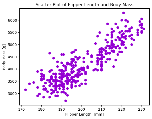
Figure 8.2 散布図/Scatter Plot
8.2.4 グループの比較のための可視化: 箱ひげ図と棒グラフ/Visualization for Group Comparison: Box Plot and Bar Plot
コード25は,書籍 p.116 の図8.3をつくる箱ひげ図のコードです。
Code-25 is a code for the box plot that creates Figure 8.3.
fig,ax=plt.subplots(2,2)
sns.boxplot(data=df,x="species",y="bill_length_mm",
ax=ax[0,0]).set_title("種別・くちばしの長さ")
sns.boxplot(data=df,x="species",y="bill_depth_mm",
ax=ax[0,1]).set_title("種別・くちばしの縦の長さ")
sns.boxplot(data=df,x="species",y="flipper_length_mm",
ax=ax[1,0]).set_title("種別・ヒレの長さ")
sns.boxplot(data=df,x="species",y="body_mass_g",
ax=ax[1,1]).set_title("種別・体重")
plt.tight_layout()
fig,ax=plt.subplots(2,2)
sns.boxplot(data=df,x="species",y="bill_length_mm",
ax=ax[0,0]).set_title("Bill Length by Species")
sns.boxplot(data=df,x="species",y="bill_depth_mm",
ax=ax[0,1]).set_title("Bill Depth by Species")
sns.boxplot(data=df,x="species",y="flipper_length_mm",
ax=ax[1,0]).set_title("Flipper Length by Species")
sns.boxplot(data=df,x="species",y="body_mass_g",
ax=ax[1,1]).set_title("Body Mass by Species")
plt.tight_layout()
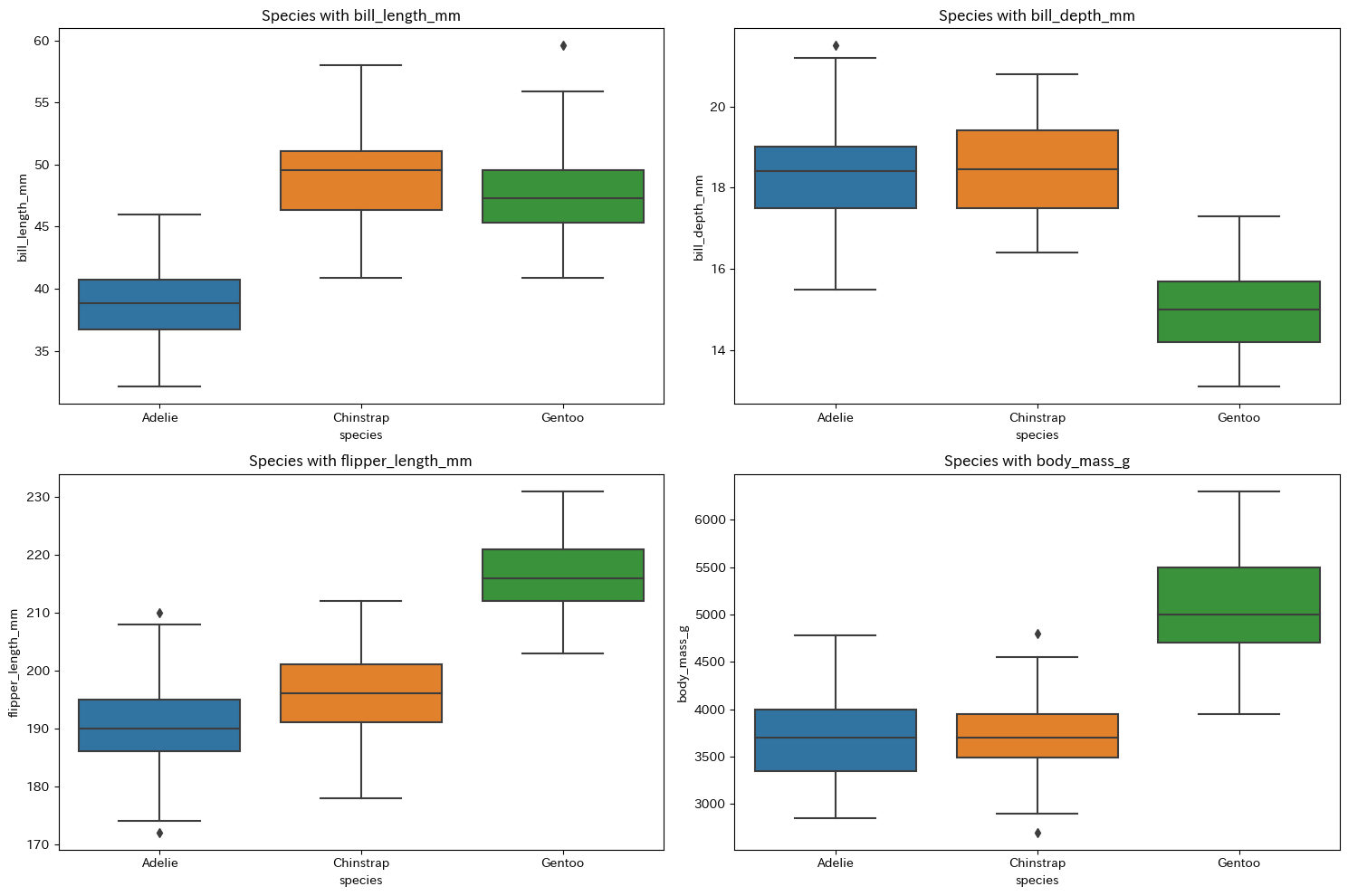
Figure 8.3 箱ひげ図/Box Plot
コード26は,島別・種別の棒グラフをつくるコードです。書籍 p.116 の図8.4をつくります。
Code-26 is a code that creates a bar chart by island and species. It creates Figure 8.4.
sns.catplot(df,x='island',hue='species',kind='count')
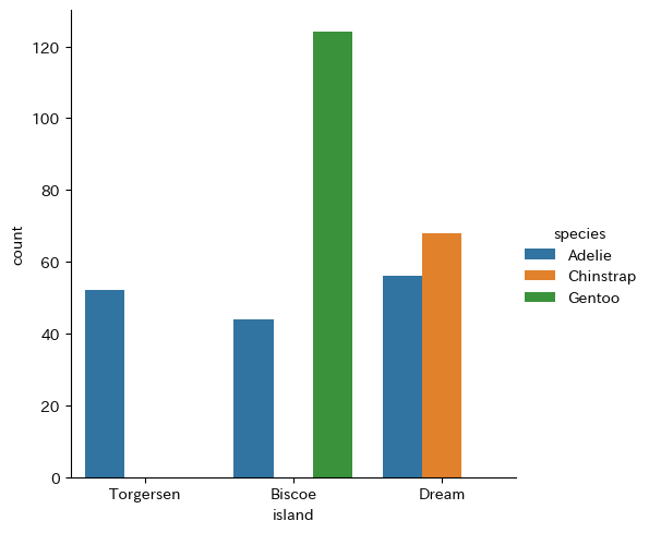
Figure 8.4 島別・種別度数の棒グラフ/Bar Chart of Counts by Island and Species
コード27は,カーネル密度曲線でジェンツー種のペンギンの体重をオス・メスで比べるもので,書籍 p.117 の図8.5をつくります。
Running code-27 will create Figure 8.5, which compares the weight of male and female Gentoo penguins on the kernel density curve.
df2 = df[df["species"]=="Gentoo"]
sns.kdeplot(df2,x="body_mass_g",hue="sex")
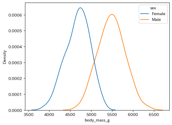
Figure 8.5 ジェンツーのオス・メス体重分布図/Distributions of Gentoo Body Mass by Sex
8.2.5 Python と SQL の連結/Connecting Python and SQL
下記のコード28は,標準ライブラリに含まれているsqlite3モジュールを読み込んで,PythonとSQLiteを接続するコードです。これは第7章で作成したdbファイルをtrial.dbという名前を付けて保存をし,それをColab Notebooksのdataディレクトリに入れておいた場合のコードです。
Use code-28 below to import the sqlite3 module included in the standard library, and to connect Python and SQLite. The code supposes that the db file created in Chapter 7 is named trial.db and saved in the "data" directory of Colab Notebooks.
import sqlite3
import pandas as pd
conn = sqlite3.connect("/content/drive/MyDrive/Colab Notebooks/data/trial.db")
下記のコード29は,接続を切るコードです。
Use code-29 below to close the connection.
conn.close